


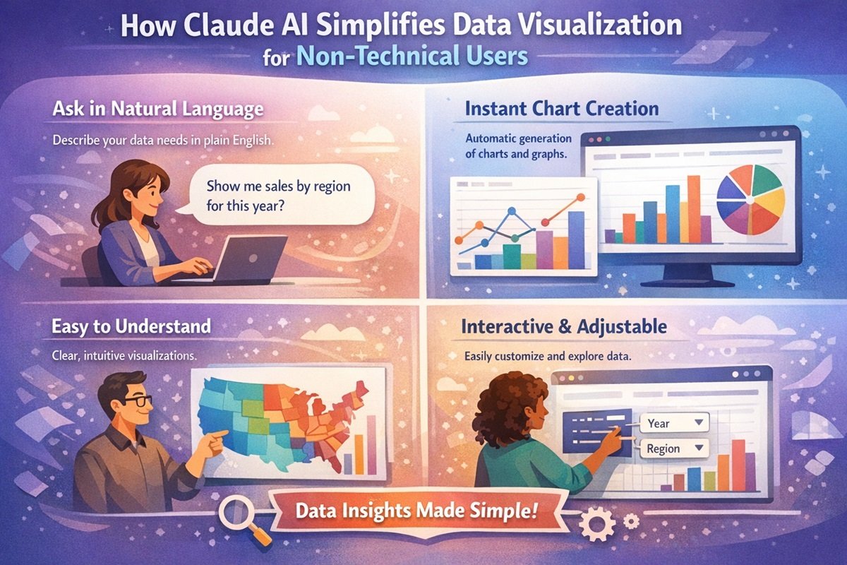
Claude AI simplifies data visualization by allowing users to generate charts and diagrams using natural language prompts. Instead of using complex software, non-technical users can upload data, request a visualization, and instantly receive interactive charts and insights.
Data visualization has become an essential part of modern decision-making. Businesses use it to understand sales trends, marketers rely on it to analyze campaign performance, educators use it to present research findings, and organizations across industries depend on visual data to guide strategy. Charts, graphs, and diagrams make complex data easier to understand and communicate.
However, creating effective visualizations has traditionally required technical knowledge. Tools like advanced spreadsheets, data analytics platforms, and visualization software often involve complex interfaces, formulas, or even programming. For non-technical users, this can make data analysis slow, confusing, and sometimes inaccessible.
This is where Claude AI data visualization changes the game. Developed by Anthropic, Claude AI allows users to create charts, diagrams, and data insights simply by describing what they want in natural language. Instead of learning complicated software, users can generate interactive charts and AI diagrams with simple prompts.
In this article, we’ll explore how Claude AI simplifies data visualization for non-technical users and why AI-powered tools are transforming how people work with data.
What Is Claude AI?
Claude AI is an advanced artificial intelligence assistant developed by Anthropic. It is designed to help users analyze information, generate content, interpret data, and solve complex problems through natural language interaction.
One of its most powerful emerging capabilities is Claude AI data visualization. Instead of manually building charts or writing formulas, users can simply describe their data and the type of visualization they want. Claude can then generate AI charts, diagrams, and structured insights automatically.
For example, a user might ask:
- “Create a bar chart comparing monthly sales.”
- “Generate a line graph showing website traffic growth.”
- “Turn this dataset into a pie chart showing market share.”
Claude processes the request, interprets the data, and generates visual representations without requiring coding or advanced analytics knowledge. This makes AI data analysis far more accessible to beginners and non-technical professionals.
Why Data Visualization Is Difficult for Non-Technical Users
While data visualization is valuable, many people struggle to create charts and reports because traditional tools require technical skills. Several challenges make this process difficult for non-technical users.
Learning Complex Tools
Many visualization tools require users to learn complicated interfaces, advanced spreadsheet formulas, or specialized analytics software. Platforms like Excel, Tableau, or BI tools can be powerful but often have steep learning curves.
Understanding Data Formatting
Data needs to be structured properly before creating charts. This includes formatting tables, cleaning datasets, and ensuring columns are organized correctly. For beginners, even small mistakes can prevent charts from working properly.
Choosing the Right Chart Type
Selecting the correct chart is another challenge. Bar charts, line charts, pie charts, and comparison charts each serve different purposes. Non-technical users may not know which visualization best represents their data.
Time-Consuming Report Creation
Creating visual reports often involves multiple steps: importing data, formatting tables, choosing chart types, customizing visuals, and generating insights. This process can take hours, especially for users who are not familiar with visualization tools.
How Claude AI Simplifies Data Visualization
The biggest advantage of Claude AI data visualization is simplicity. Instead of requiring technical skills, Claude uses natural language understanding to help users create visual data instantly.
Natural Language Prompts
Users can generate charts by simply describing what they want. This removes the need to learn complex software features.
For example:
- “Create a pie chart showing product category sales.”
- “Build a line chart comparing revenue over the last six months.”
Claude interprets the prompt and generates the visualization automatically.
Automatic Chart and Diagram Creation
Claude can transform raw datasets into structured visual outputs. This includes AI charts, comparison graphs, and even AI diagrams that explain relationships between ideas or processes.
Instead of manually building visualizations, users can focus on understanding the insights behind the data.
Interactive Data Exploration
Another benefit is the ability to explore data interactively. Users can refine prompts, adjust chart types, or request additional analysis. This creates a flexible workflow where insights evolve through conversation.
Fast Data Analysis
Claude AI also speeds up AI data analysis. Users can upload data or paste tables, and Claude can quickly summarize patterns, identify trends, and generate visualizations that highlight key insights.
This dramatically reduces the time required to transform raw data into meaningful visuals.
Examples of Visualizations Claude AI Can Create
Claude supports a wide range of visualization formats, allowing users to represent data in the most appropriate way.
Bar Charts
Bar charts are useful for comparing values across categories, such as product sales, marketing channels, or survey responses.
Line Charts
Line charts show trends over time. They are commonly used for tracking website traffic, revenue growth, or performance metrics.
Pie Charts
Pie charts help illustrate proportions within a dataset, such as market share or customer demographics.
Comparison Charts
These charts allow users to compare multiple datasets side by side, making it easier to identify differences and trends.
Flow Diagrams and Concept Diagrams
Claude can also generate AI diagrams that visualize workflows, processes, or relationships between ideas. This is particularly helpful for presentations and strategic planning.
Practical Use Cases
Claude AI data visualization is useful across many industries and professions.
Marketing Analysis
Marketers can visualize campaign performance, website traffic trends, and conversion metrics without needing advanced analytics tools.
Small Business Insights
Small business owners can quickly track revenue trends, inventory data, and customer behavior through simple AI charts.
Academic Research
Students and researchers can visualize research data, survey results, and experiment outcomes without learning complex statistical software.
Content and Reporting
Content creators and analysts can generate charts and AI diagrams for reports, presentations, and articles to make insights easier to understand.
Step-by-Step Example: Creating a Chart with Claude AI
Using Claude for visualization typically follows a simple workflow.
Step 1: Upload or Paste Data
The user uploads a dataset or pastes a table of values into the chat.
Step 2: Write a Prompt
The user describes the desired chart. For example: “Create a bar chart showing monthly sales.”
Step 3: Claude Generates the Visualization
Claude processes the request and produces a visual representation of the data.
Step 4: Refine or Analyze
The user can ask follow-up questions such as:
- “Highlight the highest sales month.”
- “Convert this to a line chart.”
- “Summarize the key trends.”
This conversational workflow makes no-code data visualization far more accessible.
Claude AI vs Traditional Data Visualization Tools
| Feature | Claude AI | Traditional Tools |
|---|---|---|
| Ease of Use | Natural language prompts | Complex interfaces |
| Technical Skills | No coding required | Often requires formulas or scripting |
| Speed | Instant chart generation | Manual setup required |
| Accessibility | Designed for beginners | Better suited for trained analysts |
Limitations to Be Aware Of
While Claude AI is powerful, it is not a complete replacement for traditional analytics tools.
- Large enterprise datasets may still require specialized analytics platforms.
- Highly customized visual dashboards may need advanced visualization software.
- Complex statistical modeling may require dedicated data science tools.
However, for everyday data exploration and visualization, Claude offers an extremely efficient solution.
Future of AI-Powered Data Visualization
AI tools are rapidly changing how people interact with data. Instead of relying on technical specialists, individuals across industries can now explore data independently.
As AI technology continues to improve, tools like Claude may integrate even deeper analytics capabilities, smarter chart recommendations, and automated insights. This shift could make data literacy far more widespread, enabling professionals at every level to make data-driven decisions.
The rise of no-code data visualization platforms powered by AI will likely play a major role in democratizing analytics.
Conclusion
Data visualization is essential for understanding information, but traditional tools often create barriers for non-technical users. Complex interfaces, data formatting challenges, and time-consuming workflows can make visualization difficult for beginners.
Claude AI data visualization removes many of these barriers by allowing users to generate AI charts, diagrams, and insights using simple natural language prompts. This makes AI data analysis faster, easier, and far more accessible.
By lowering the technical barrier to working with data, Claude AI empowers marketers, business owners, students, and professionals to explore insights and communicate ideas more effectively. As AI-powered visualization tools continue to evolve, they will likely play a key role in making data-driven decision-making accessible to everyone.
FAQs
What is Claude AI data visualization?
Claude AI data visualization refers to the ability of Anthropic’s Claude AI to generate charts, graphs, and diagrams from datasets using natural language prompts.
Can non-technical users create charts with Claude AI?
Yes. Claude AI is designed to support no-code data visualization, allowing users to create charts simply by describing what they want.
What types of charts can Claude AI generate?
Claude can generate bar charts, line charts, pie charts, comparison charts, and various AI diagrams for workflows or concept visualization.
Is Claude AI better than traditional data visualization tools?
Claude AI is easier for beginners and faster for quick insights. However, advanced analytics and enterprise dashboards may still require specialized tools.
How does AI improve data visualization?
AI simplifies the process by automating chart creation, analyzing datasets quickly, and allowing users to interact with data using natural language.
So, this was the BigStory of how Claude is making data visualization more accessible for everyone. By turning simple prompts into charts, diagrams, and visual insights, Anthropic is helping non-technical users explore and understand data without complex tools or coding. At BigStories, we explore the technologies that are reshaping how people work with information, creativity, and intelligence. If this story sparked your curiosity, share it with others interested in the future of AI-powered analytics, and explore more BigStories uncovering the innovations transforming our digital world @digitalexpresshub. 🚀